
Still need help?

This article explains the Action Button block that can be added to design an app.
This button allows end-users to navigate to other Clappia apps within the workplace. It can navigate to the other app’s Home page, Submissions tab, and Analytics tab. The button can also be used to navigate to external sites.

In the Design App tab, click on Add Field and select the Action Block. Start editing on the panel that appears on the right side.

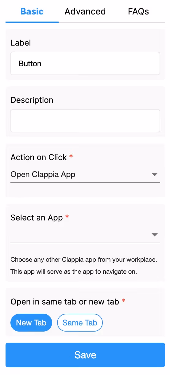
This is what appears as the name of the action button to the end-user.

This is the text that goes below the action button to help the user with some information, or it could be left blank.
This is used to decide whether the button will navigate to another Clappia app within the workplace or to an external site.


If ‘Open Clappia App’ is selected, additional fields for configuration appears:
Here you can select an app available in the workplace, where the action button will navigate the user to upon being clicked.


Once an app is selected, this field will appear. Select the tabs within the selected app for the user to be navigated to. The user can be navigated to the selected app’s Home page, Submissions tab, or Analytics tab.


Note:
Selecting ‘Home’ as the view type:
This allows the user to be navigated to a certain field, section, or page (if page breaks are inserted in that app) within the app they are navigated to.


Select ‘Page’ if you want the user to be navigated to the beginning of an app or to a certain page within that app. If there are no multiple pages for an app, simply select ‘Page 1’ for the Navigate to page field that appears at the bottom of the Navigate to field.


Similarly you will get a ‘Navigate to field’ or ‘Navigate to section’ field if the ‘Navigate to’ is configured as field or section respectively.
This is to redirect a user to external sites.

If ‘Open Link’ is selected in Action on Click field, the additional field for configuration appears:
Add the website link to redirect the user.

This option configures a timer-based action, allowing a delay or specific end time before performing a designated action.

Wait For Seconds
Set a duration (in seconds) for which the button will wait after being clicked. The post-stop action will execute after this timer runs out.
Wait Till Specific Date and Time
Set a target date and time, either manually or by using app variables, for the timer. This option is useful for specific scenarios, such as exams where the timer should expire at a predefined end time.

If the date and time blocks are added to the app and those values need to be pulled, type in @ followed by the field name to pull the values dynamically.
Post Stop Action
This field determines what action occurs once the timer ends. Options include:


Important Note:

The Advanced Label option allows you to change the label of a field dynamically based on a condition you define. Instead of always showing the same fixed label under the ‘Basic’ tab, the field can display different labels depending on requirements of the form. Use spreadsheet-like functions such as IF, AND, OR, etc. and make use of other field variables to set your conditions. Type @ and select the field.
This is useful when the meaning of a field changes based on context, business logic, or user choices.
For example:
If you have a dropdown called Action with options “Approve” and “Reject”.
The label should match the selected action.
Formula:
IF({action} = "Approve", "Approve", "Reject")
This allows the same field to adapt its displayed purpose without needing multiple separate fields.
The Advanced Description option works exactly like Advanced Label, but it changes the description text instead. This is useful when guidance or instructions for a field need to change depending on earlier answers.
For example, using the same scenario from Advanced Label:
If you have a dropdown called Action with options like “Approve” and “Reject”, you may want the description of your Button to guide the user differently depending on what they selected.
So:
– If the user selects Approve, the description could say: “Click to approve this submission.”
– If the user selects Reject, the description could say: “Click to reject this submission and send feedback.”
Formula:
IF({action} = "Approve", "Click to approve this submission.", "Click to reject this submission and send feedback.")
This helps users understand what is required from them without showing unnecessarily long or irrelevant instructions.
Additional Examples (Apply to Both Advanced Label and Advanced Description)
1. Showing nothing until a selection is made
For example, if you have a dropdown field called Visit Category with options “Routine” and “Urgent”, you may want the label or description of a field to remain blank until the user first selects a category.
Once a selection is made:
Formula (can be used in either Advanced Label or Advanced Description):
{visit_category}The label/description stays empty until the dropdown has a selected value.
After the user picks an option, the selected text (Routine or Urgent) becomes the label or description.
2. Changing label/description based on language selection
For example, if your form includes a dropdown field called Select Language with options English, Spanish, and French, you can show the label or description in the selected language.
So:
Formula (can be used in either Advanced Label or Advanced Description):
IF({select_language} = "English", "Enter details", IF({select_language} = "Spanish", "Ingrese detalles", "Entrez les détails"))The formula returns the text for the selected language.
Only one label/description is shown at a time, depending on what the user picks in the Select Language dropdown.
1. Variables do not change
When a field is created, its variable name is derived from the label you set in the Basic tab. That variable name is what you must use in formulas, workflows, and other logic. The visible label or description shown by Advanced Label / Advanced Description does not change the variable name.
2. Submissions tab: table view vs right panel
In the Submissions area, the table view always displays the labels from the Basic tab. When you open an individual submission, the right panel shows the labels and descriptions as they appear in the form (i.e., the Advanced Label and Advanced Description applied for that submission). This keeps the submission list consistent while letting reviewers see the context-aware labels and descriptions when viewing a record.
3. Bulk Edit shows Basic tab labels and descriptions
When you need to Bulk Edit submissions, the spreadsheet you download shows the labels and descriptions from the Basic tab only. Advanced Label and Advanced Description are not applied in Bulk Edit, so keep that in mind when preparing bulk updates.
4. Some fields cannot be used inside Advanced Label/Description formulas
Certain block types do not expose a variable that can be referenced in Advanced Label or Advanced Description. If a block does not expose a variable, you cannot use it inside the formula.
Geo Address
GPS Location
PaymentGateway
Audio
Live Tracking
Signature
Code Scanner
NFC Reader
Get Data from RestApi
Get Data from Other Apps
Get Data from Google Sheets
Get Data from Database
AI Block
Text, HTML & Embedding
Attached Files
Image Viewer
Video Viewer
PFD Viewer
Code block
Progress Bar
Action Button

Select where the button is to be aligned.
Use this if you want to show or hide the action button under certain conditions. It accepts the standard Clappia Formulae, similar to conditional sections.


L374, 1st Floor, 5th Main Rd, Sector 6, HSR Layout, Bengaluru, Karnataka 560102, India
3500 S DuPont Hwy, Dover,
Kent 19901, Delaware, USA


.svg)


3500 S DuPont Hwy, Dover,
Kent 19901, Delaware, USA
L374, 1st Floor, 5th Main Rd, Sector 6, HSR Layout, Bengaluru, Karnataka 560102, India