
Still need help?

Dashboard Design in Clappia lets you customise what users see immediately after they log in to your workplace. Instead of a plain dashboard, you can add visual and informational elements such as banners, announcements, images, videos, embedded content, or custom HTML blocks.
This is commonly used to:
All elements added here appear above the app icons on the main dashboard and are visible only on the dashboard view.
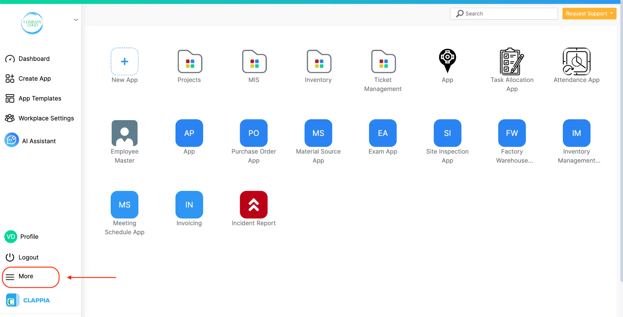
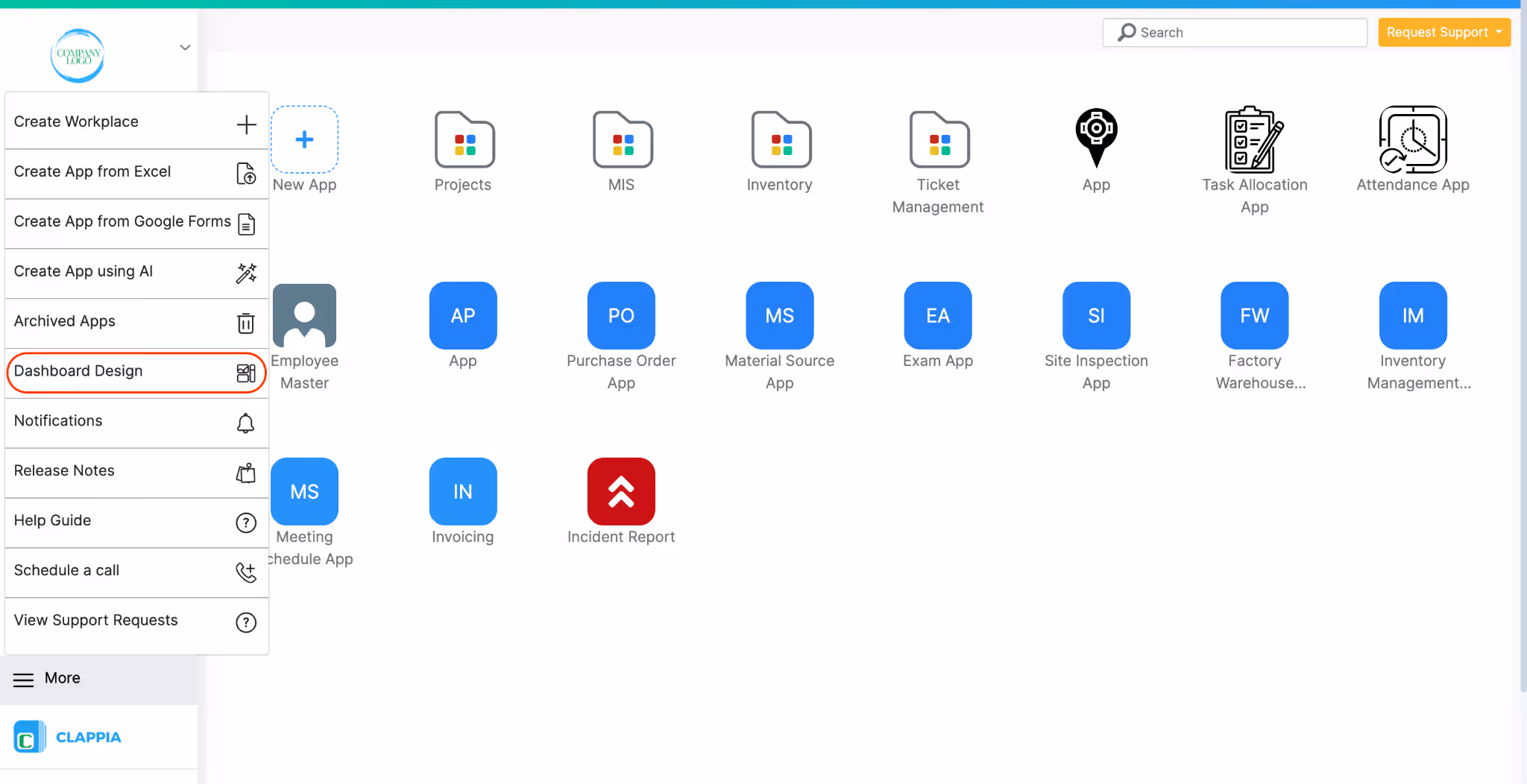
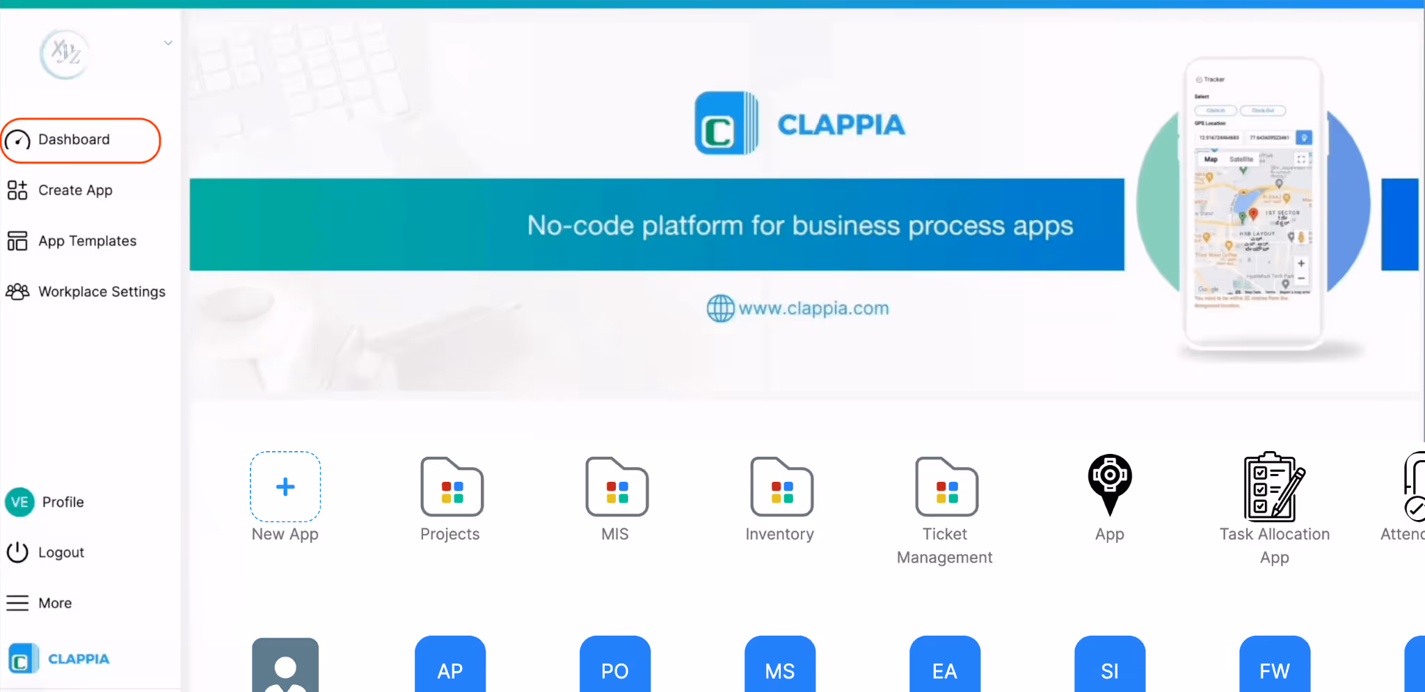
Sign in to your Clappia workplace. From the left navigation panel, click More > Select Dashboard Design.
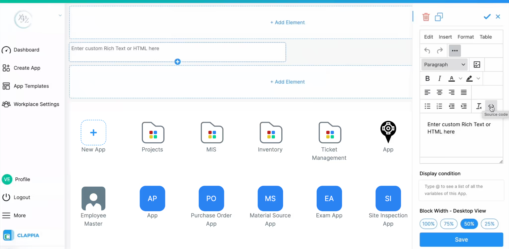
You will be taken to a preview view of your workplace dashboard.
At the top, you’ll see empty placeholder sections marked with + Add Element. These represent positions where dashboard elements can be added.
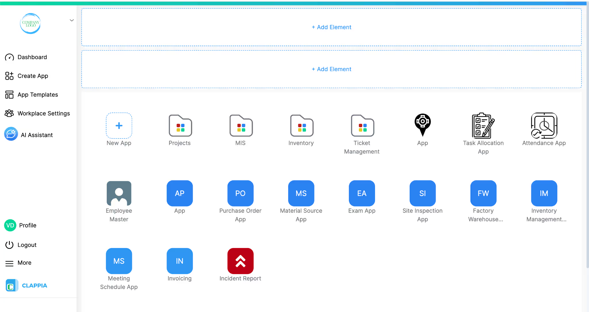
This page is a live preview; what you configure here is how users will see the dashboard when they log in.
Click + Add Element at the position where you want the element to appear.
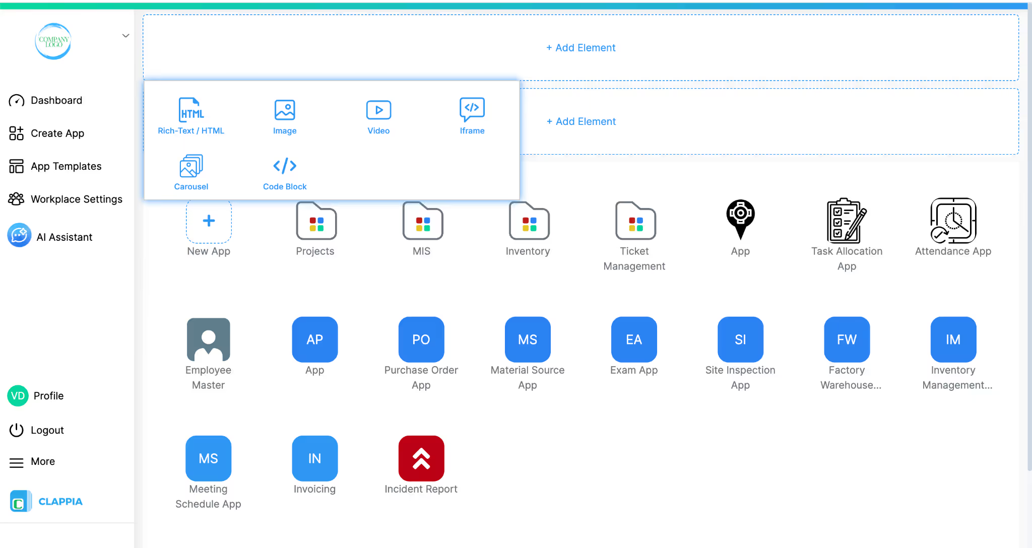
When you do this, a panel opens showing the available element types:
Each element is added independently and configured from the right-hand panel.
Elements cannot be rearranged later.
To control its order, you must click + Add Element either above or below an existing element at the time of adding it.
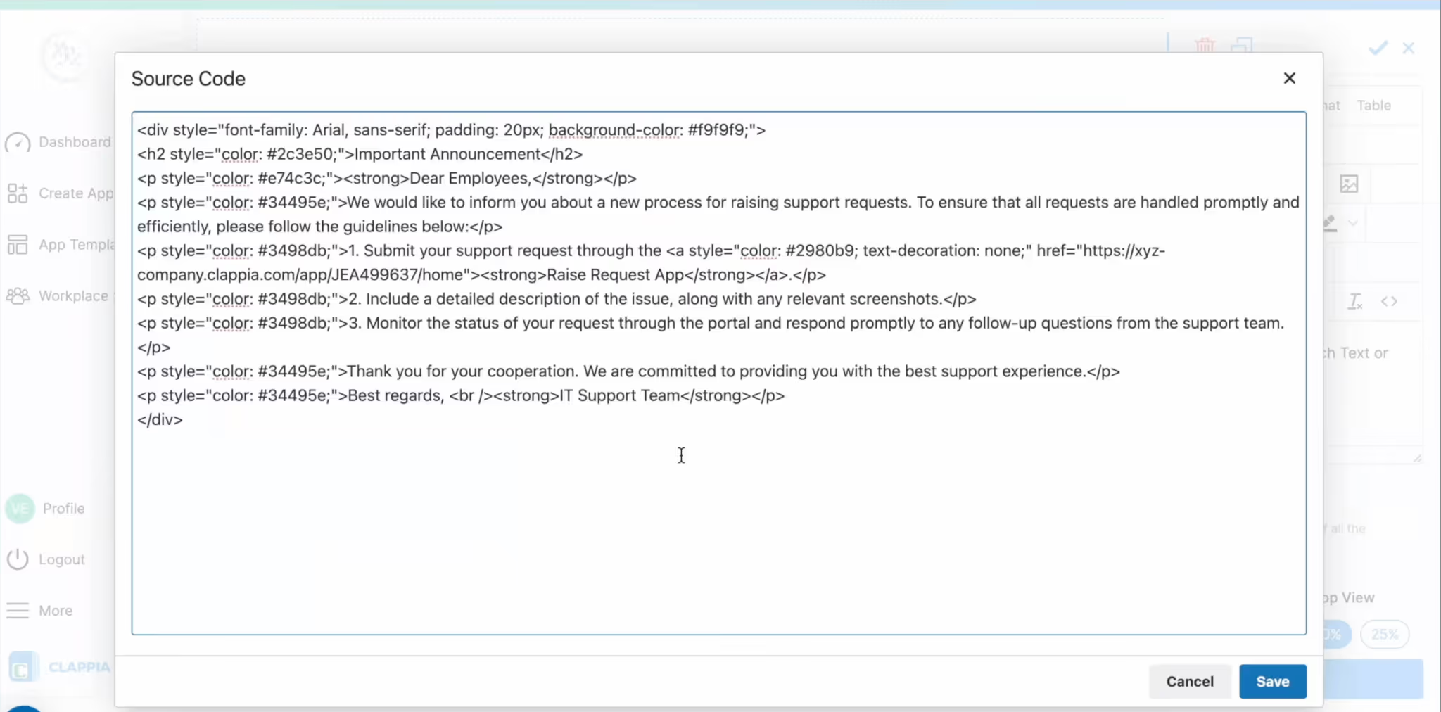
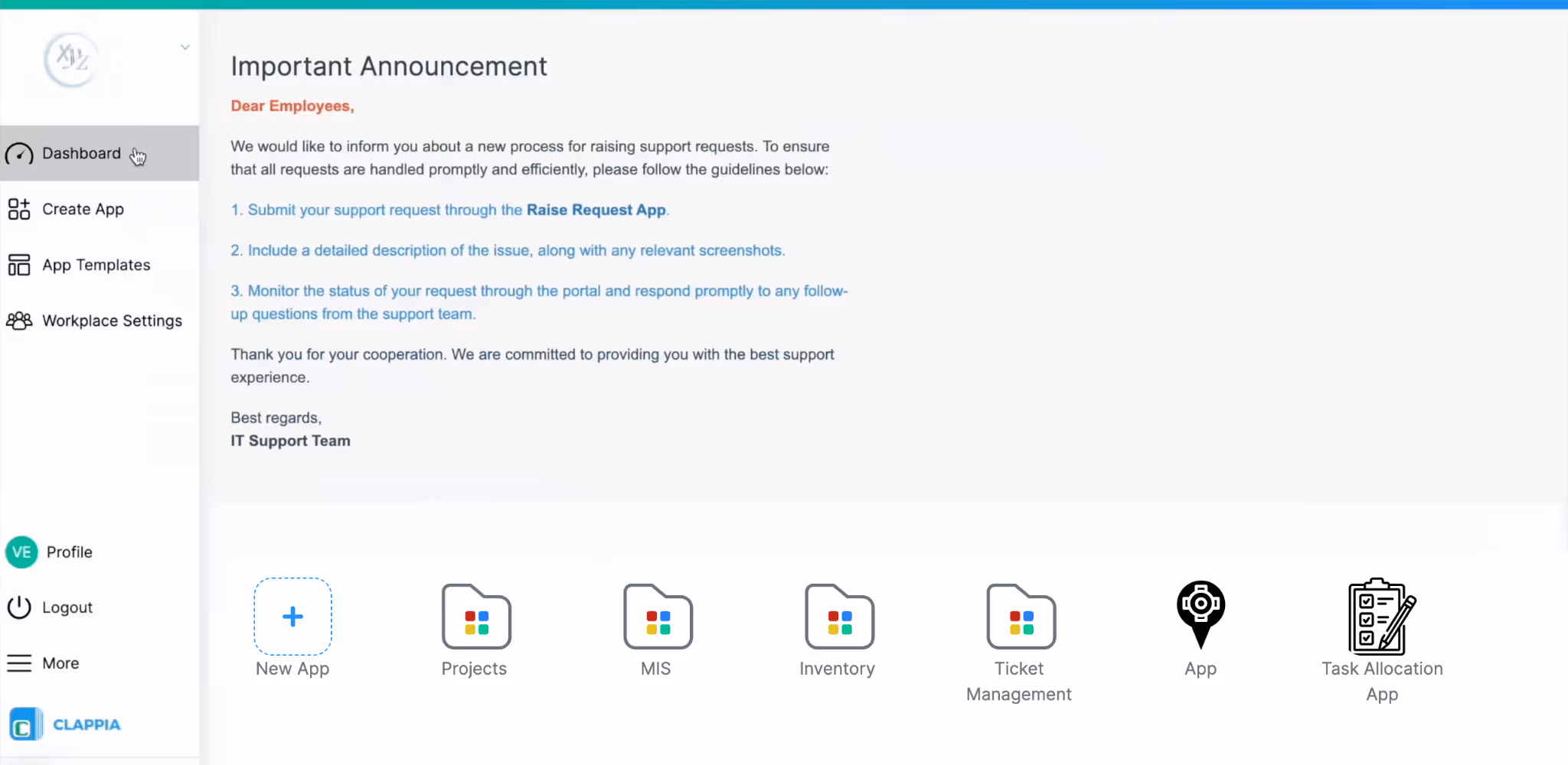
This element is used to display formatted text or custom HTML content.
When selected, a text editor opens on the right side. This editor allows you to:
This is particularly useful when you want to:
If you are not familiar with writing HTML, you can generate simple HTML snippets using online HTML generators or tools like AI-based code generators and paste the output into the source view.
Use this element to upload and display static images such as banners or infographics.
Images are uploaded via drag-and-drop or file selection.
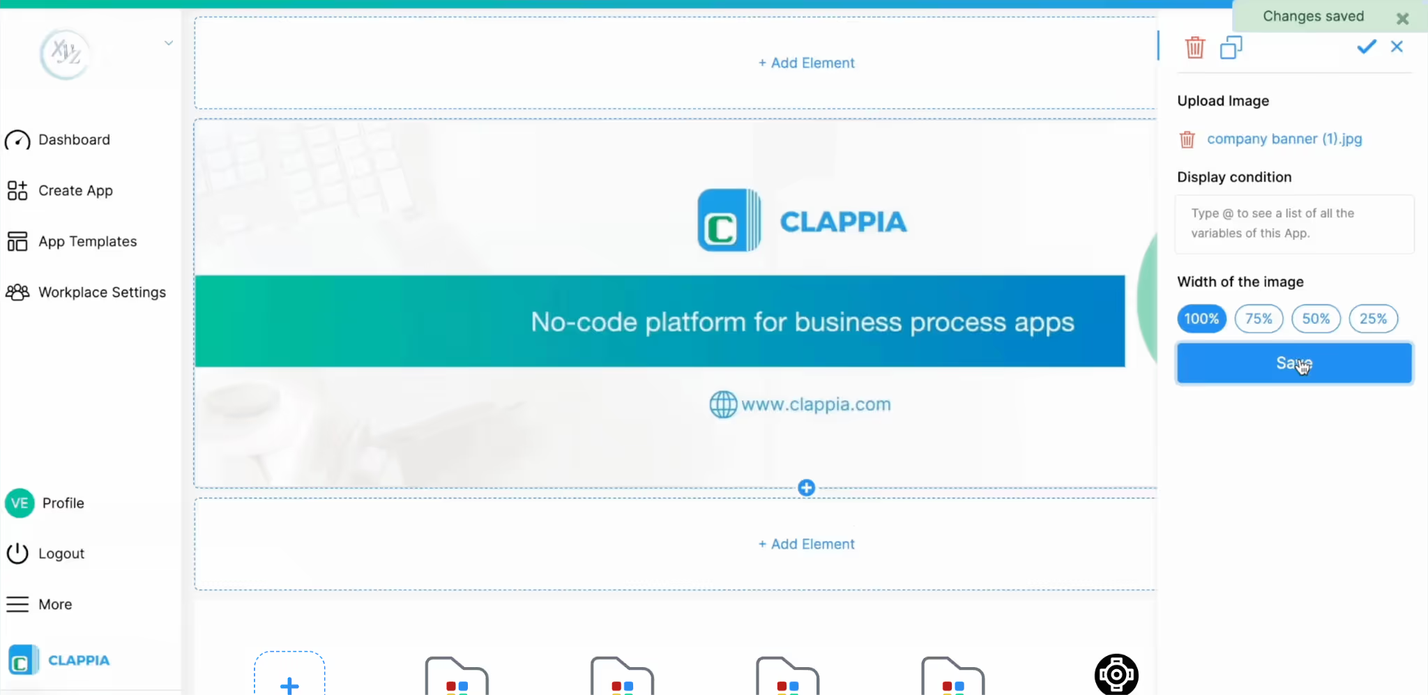
You can control how much horizontal space the image occupies by selecting the width of the image. If very tall or large images are uploaded, they may take up significant dashboard space. Adjust image dimensions before uploading if needed.
Images are useful for branding, announcements, or visual instructions.
This element lets you upload video files directly to the dashboard.
Available options:
Videos are useful for onboarding clips, internal announcements, or training messages.
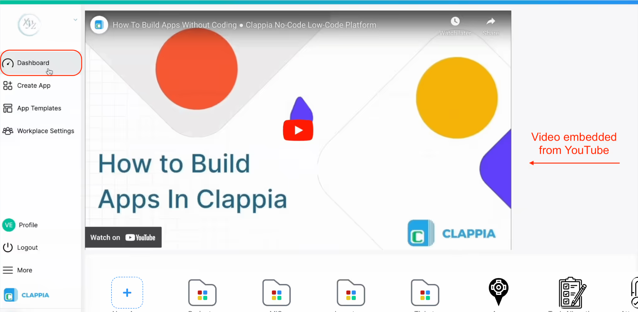
The iframe element allows embedding external content using an embed source. Paste an embed URL or iframe code into the Enter source field.
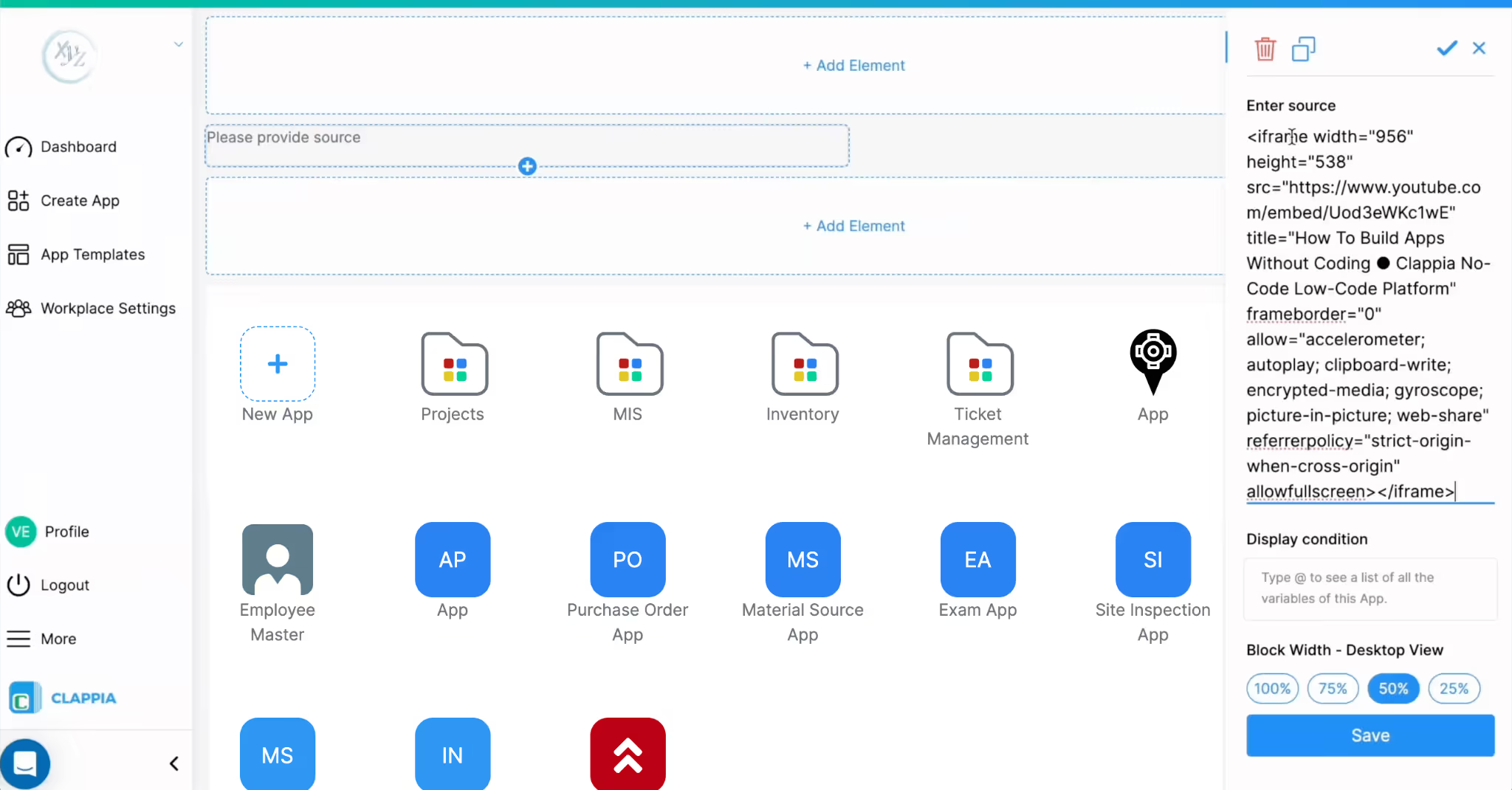
Some common use cases:
This is useful when content is hosted outside Clappia but needs to be visible on the dashboard.
The width and height can be adjusted inside the iframe code itself.
A carousel allows you to upload multiple images that users can scroll through. Images are uploaded together as a set.
Useful for rotating announcements, multiple banners in a single space, step-by-step visuals.
Like other elements, the carousel also supports display conditions and width control.
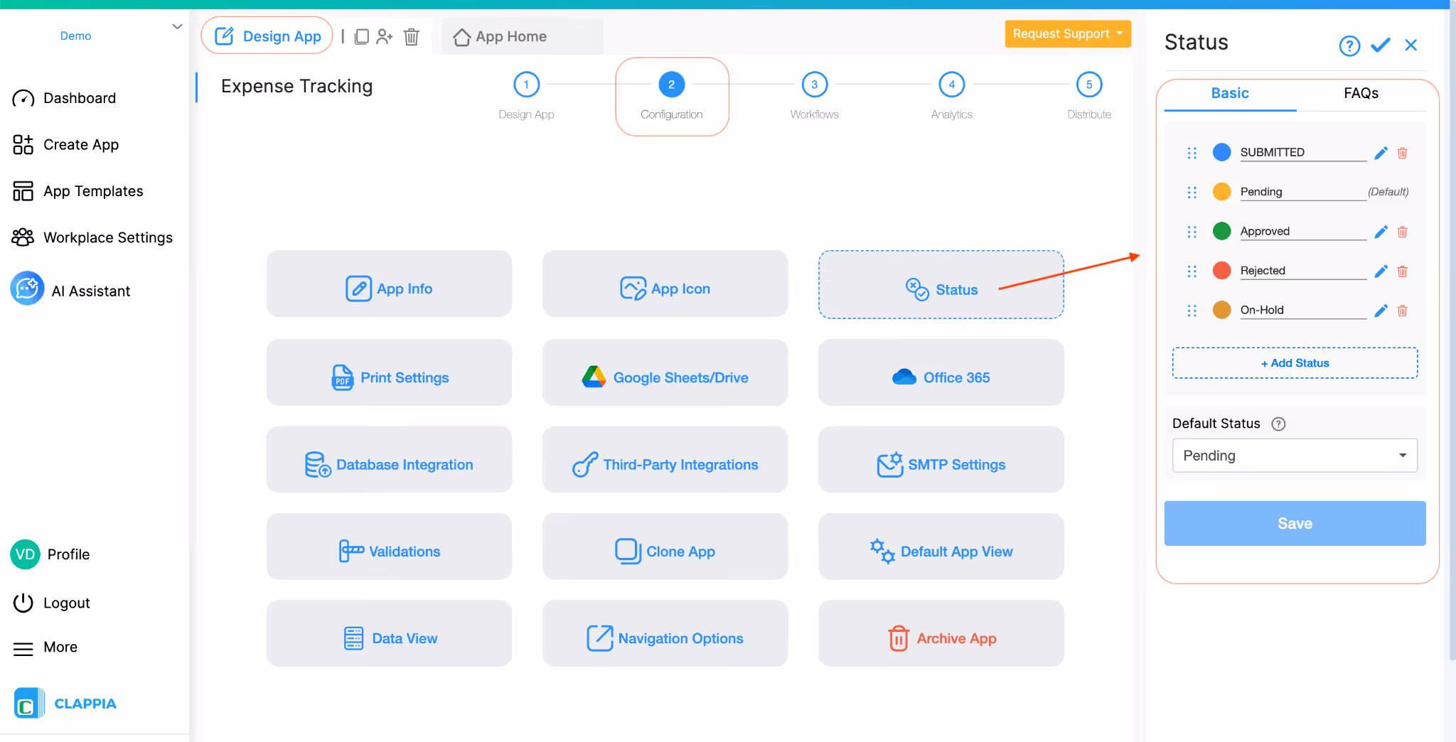
The Code Block is used for advanced customisation. It allows you to insert custom code to render dynamic content on the dashboard.
This block is typically used when:
Because this involves code, it is configured using Javascript. If you are unfamiliar with this type of code, you can always use AI to generate the code for you and paste it in the code block element.
In this example, the dashboard is configured to display live counts of submissions from another app in the same workplace.
Suppose a workplace has an Expense Tracking app where employees submit expense claims. Each submission goes through an approval process and can have statuses such as Approved, Pending, On-Hold, or Rejected.
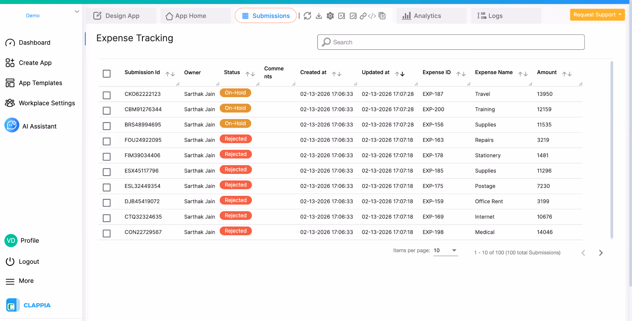
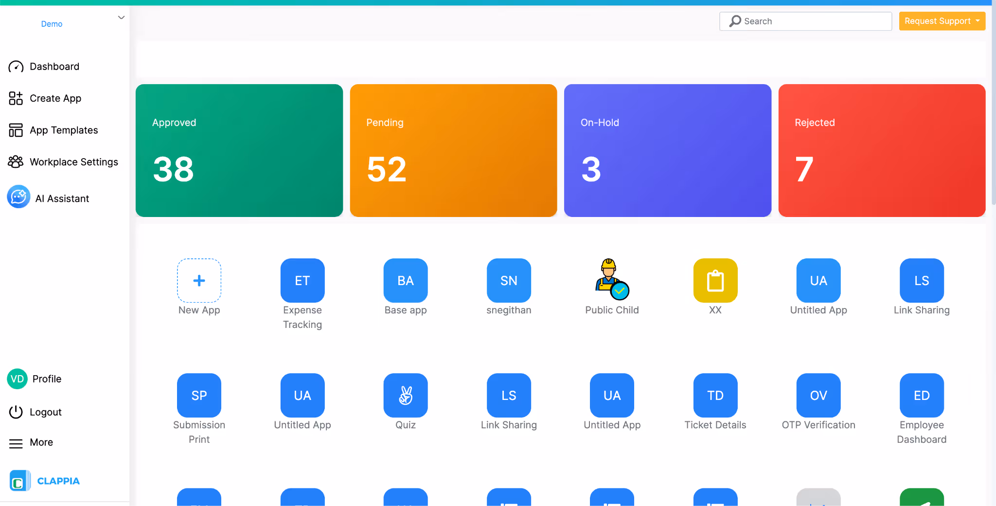
Instead of opening the app and checking submissions manually, the workplace dashboard can show a quick summary of how many submissions exist in each status as you can see in the image below.
This is achieved by using a Code Block element to fetch submission data from the Expense Tracking app and then displaying the results in visual cards on the dashboard.
When users open the workplace dashboard, they see four cards at the top showing the current number of submissions in each status.
How it Works
The dashboard design contains two main parts:
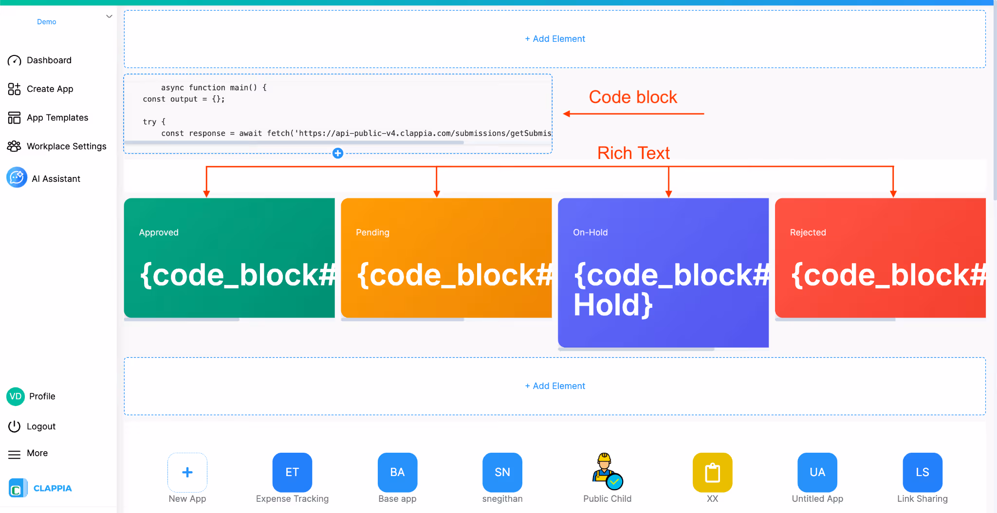
Code Block (for data retrieval)
This block is responsible for retrieving submission data from the Expense Tracking app and preparing the values that will be displayed on the dashboard. You can view the full code at the end of this guide.
The script inside the Code Block calls the Clappia Public API and requests a summary of submissions from the app. Instead of retrieving every submission individually, the request asks for an aggregated count of submissions grouped by their Status field.
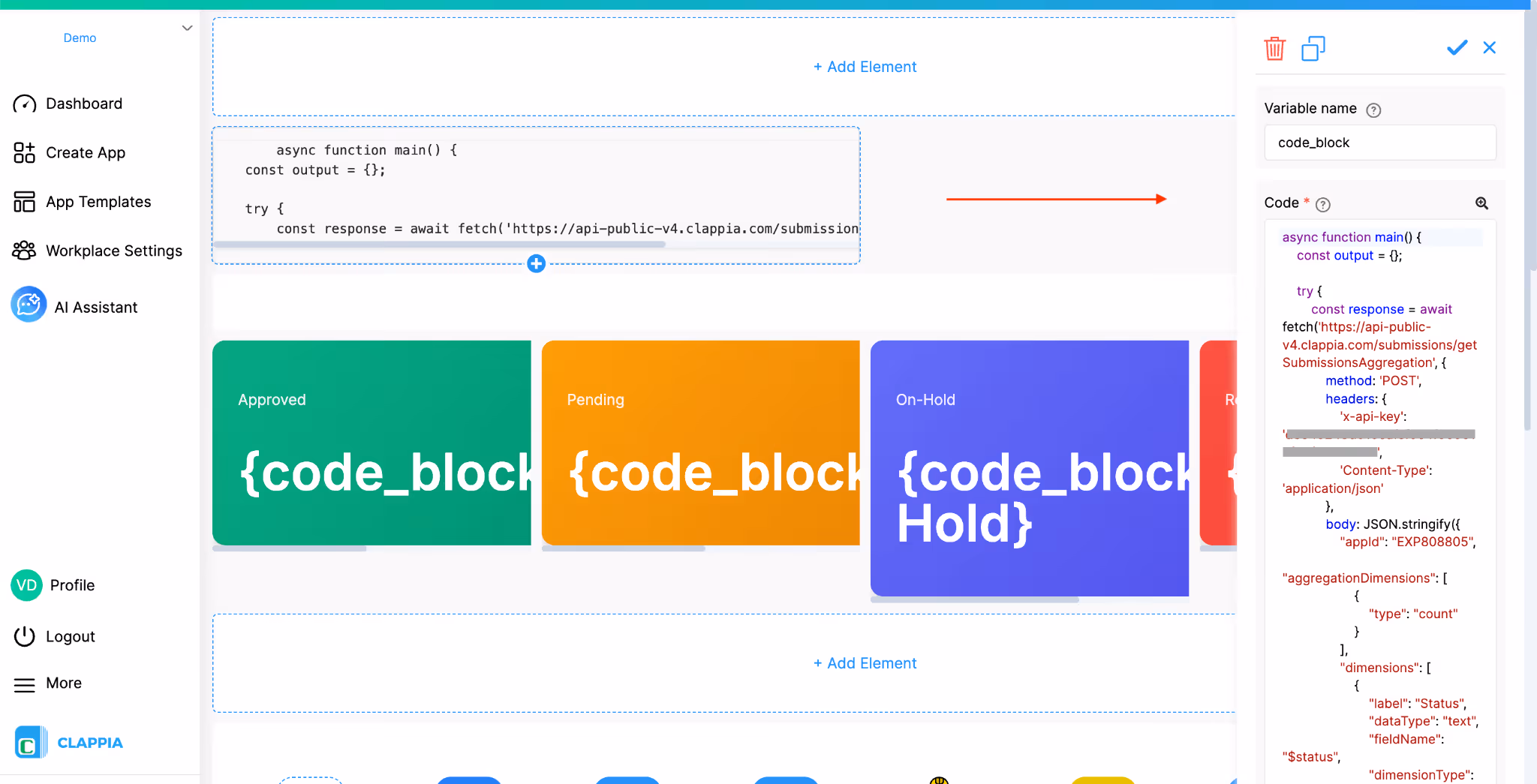
This allows the dashboard to quickly determine how many submissions currently fall into each status, such as Approved, Pending, On-Hold, or Rejected.
Once the API returns the counts, the script assigns these values to the output object inside the code. For example, when the script encounters a status in the response, it stores the corresponding count like this:
These values are then returned at the end of the script.
The Output Fields configured in the Code Block correspond to these values. Each output field represents one status count that the script produces. By defining these outputs, the values retrieved by the script become available to other elements in the dashboard design.
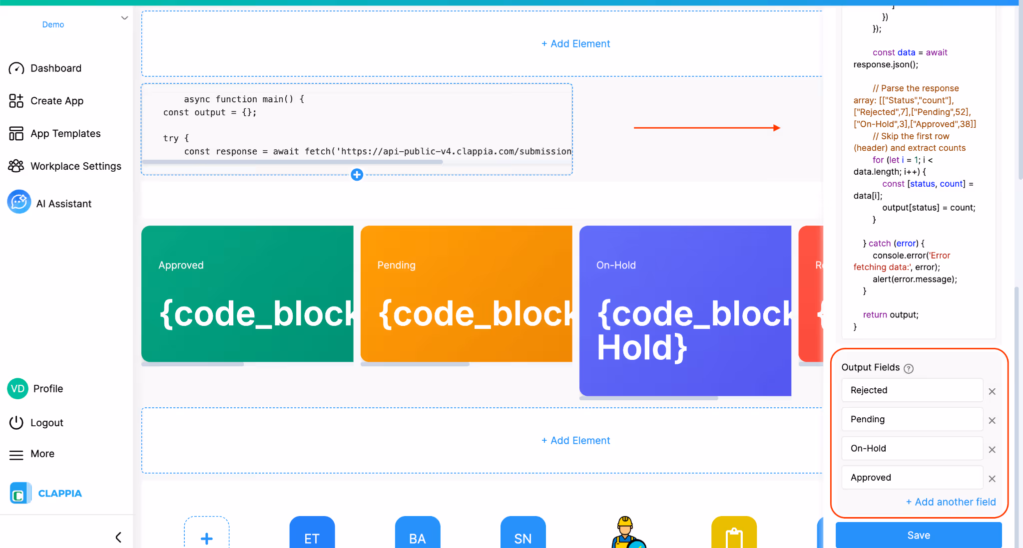
In this example, the Code Block outputs four values:
These outputs act as dynamic variables that can be used elsewhere in the dashboard.
HTML cards (for data display)

Below the Code Block, Rich-Text / HTML elements are used to design visual cards. Here, 4 of these elements are used to display each status individually. Inside the source code window (<> icon), an HTML code is inserted using the code block element’s output variables.
{code_block#Approved}
{code_block#Pending}
{code_block#On-Hold}
{code_block#Rejected}
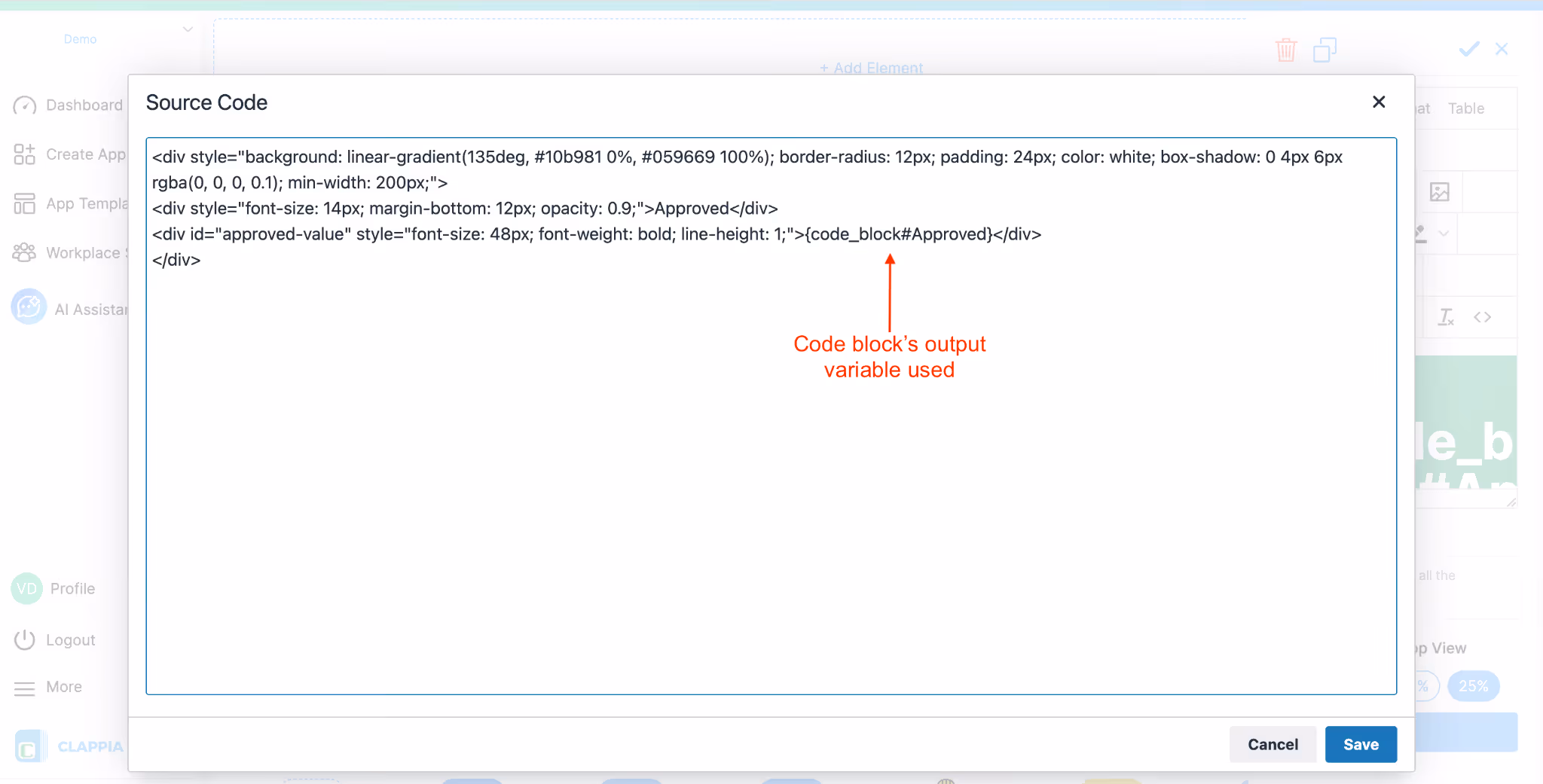
When the dashboard loads, the HTML cards display the values returned by the Code Block outputs. Each card therefore shows the current count for that status.
Live Updates Shown on Dashboard
Because the data is fetched directly from the source app, the dashboard values reflect the latest submission data.
For example:
As a result, the dashboard acts as a quick overview of submission activity without requiring users to open the app or navigate to the submissions page.
Every dashboard element supports a Display Condition in the right panel.
Display conditions allow you to control which users can see a specific element.
Type @ to see the available variables. These variables are based on user attributes. User attributes come from Workplace Settings → Users, where attributes like department, role, or custom fields are defined.
Example for display condition include:
Each element’s visibility is evaluated independently based on the condition you define.
For every element added to the dashboard:
If you want to replace content (for example, a different image or video), you can edit the element instead of deleting it.
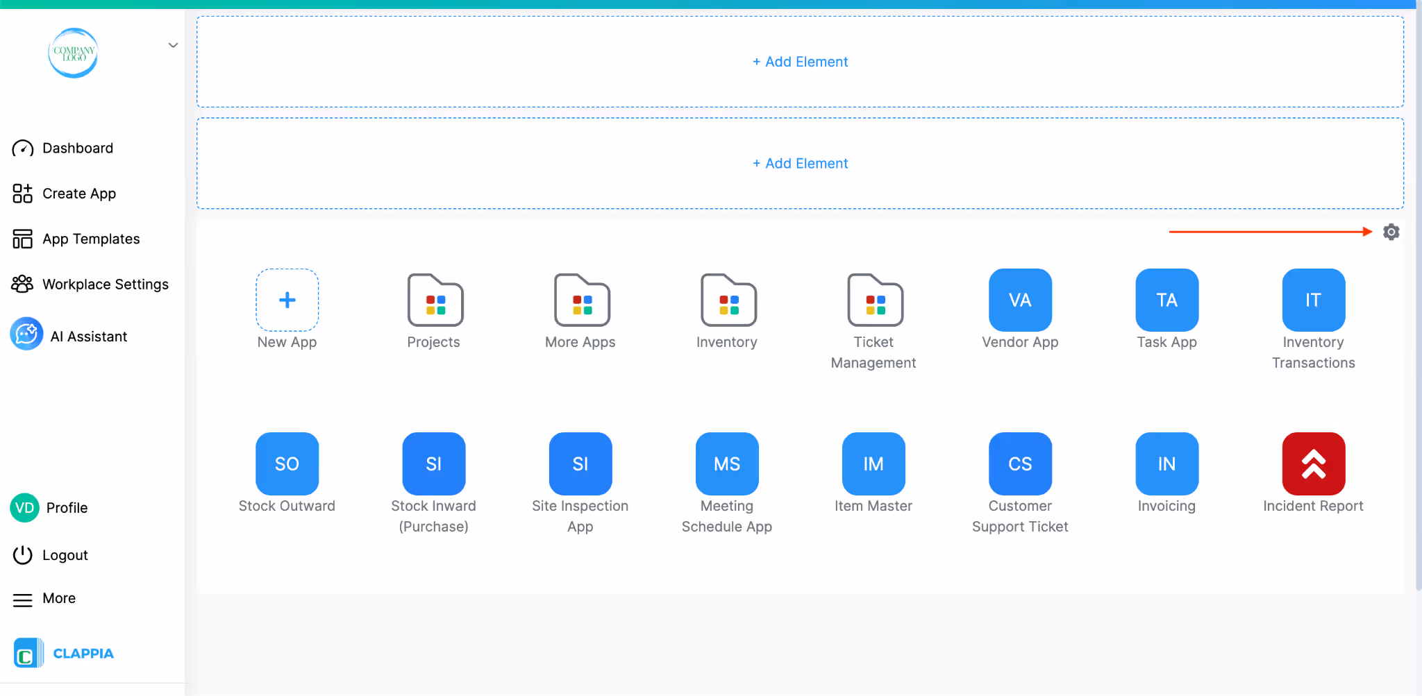
You can control the visibility of the Apps List on the workplace dashboard using a Display Condition in Dashboard Design. This allows you to show or hide the entire apps panel based on specific conditions.
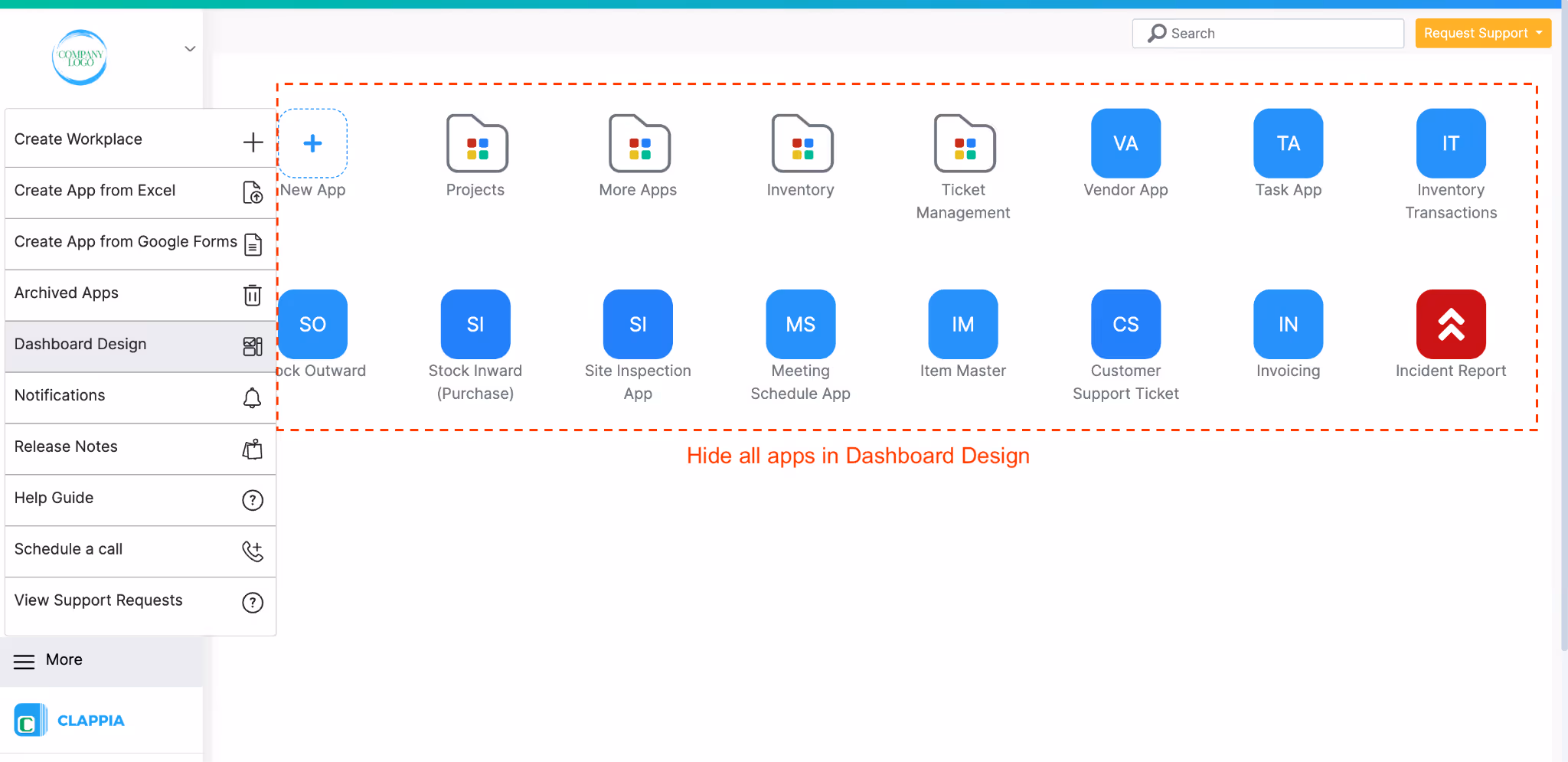
In Dashboard Design, just above the apps list (and below the area where you add design elements), click the settings icon on the right side. This opens a panel where you can define a Display Condition for the apps list. This setting applies to the entire apps list and not individual apps.
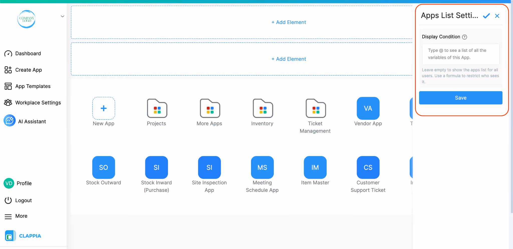
In the Display Condition field, you can enter Excel-like formulas and use workplace-level variables. For example, if you want only a specific user to view the apps, you can use:
{$currentUserEmail} = "john@email.com"
This will make the apps visible only to that user. You can also use other user attributes if they are configured. Click here to know more about workplace variables.
Leave the condition empty to show the apps list to all users. Use a formula only when you want to restrict visibility.
L374, 1st Floor, 5th Main Rd, Sector 6, HSR Layout, Bengaluru, Karnataka 560102, India
3500 S DuPont Hwy, Dover,
Kent 19901, Delaware, USA


.svg)


3500 S DuPont Hwy, Dover,
Kent 19901, Delaware, USA
L374, 1st Floor, 5th Main Rd, Sector 6, HSR Layout, Bengaluru, Karnataka 560102, India