
Still need help?

Use the Validation block in the App Design to prevent or warn the end user from entering Invalid or Duplicate Inputs.

Click on the Validation block. A Right Panel for editing appears on the right side. Start editing the fields from the Right Panel.

Description is positioned below the coloured block which further explains to the end user about the Validation Message that appears before submitting the data. Description is an optional field.
Duplicate Validation option allows the end user to enter unique data each time. The end user can input any data only once and cannot input the same data again.
Condition: Phone Numbers must be unique and should not be repeated inputs
Select Type of Validation: Duplicate
Select Fields: Email
Select Validation Level: Error (Red Coloured Box)
Input Validation Message: Email already used! Use another

This is how it will look to the end user during submission:
1. The end user enters the email ID as: “test@test.com” and submits. Here are the submission details:

2. The end user while creating another submission enters the same email ID: “test@test.com”.
Now the Validation block appears with the Validation message, “Email already used! Use another” and blocks the submission of the data.

The desired condition is proved to be true. An email ID can only be entered once and hence Duplication of Data is prevented.

This field is visible only when Type of validation - Duplicate is selected. This field allows the App Designer to choose an Input Block to check for Duplicate submissions when the end user inputs the data.
Considering the above example, the Phone Number block is the selected input block to check for Duplicate submissions and hence the end user will not be able to enter a phone number more than once.
Validation Level depends on whether or not the desired condition is met.
There are 3 levels of Validation: Error, Warning, Success

Error - Validation Message is displayed in a Red coloured box signifying error in the input data and the end user cannot submit the data since the submissions are blocked.
Warning - Validation Message is displayed in a Yellow coloured box signifying error in the input data and the end user can edit the input data & submit. Submissions are not blocked.
Success - Validation Message is displayed in a Green coloured box signifying no error and the end user can submit the data. Submissions are not blocked.
Validation Message appears when the defined validation condition becomes true. It is editable and can be customised based on the requirement.
This works exactly like the 'Calculation & logic' block.
You can include field variables and Excel formulas within the validation message. This allows you to dynamically display values or computed results to the user instead of showing a static message.
For example, you can reference a field value or use a formula to show a calculated limit or condition directly in the message. To show other field values in the message, simply type @ and select the field from the list that appears.
This helps provide clearer and more contextual feedback to users based on the data entered in the form.
Custom Validation option allows the end user to validate the inputs entered in the current submission.
Condition: A User has to Rate an Outlet for the following factors on Rating Block:
Ease of Entry/Exit
Cleanliness
Staff Behaviour
The Calculation & Logic Block Represents the Overall Rating Corresponding to the Appropriate Formula which calculates the Average of the Three Ratings.
The Formula to calculate Average: Type @variable name to get the Variables
(@entry_access + @cleanliness + @staff_behaviour)/3
If the Overall Rating turns out to be greater than or equal to 4 then the Validation Level selected is Green Coloured Box which is set to Display ‘Awesome’.
Select Type of Validation: Custom
Input Validation Condition: @overall_ra>=4 (@variable name should be typed and selected)
Select Validation Level: Success (Green Coloured Box)
Input Validation Message: Awesome

Ratings:
Entry Access: 4
Cleanliness: 4
Staff Behaviour: 4

So the Average calculated will be 4 which is greater than or equal to 4.
The condition is true and Green Coloured Box with 'Awesome' is displayed.
If the Overall Rating turns out to be greater than or equal to 3 and less than 4 then the Validation Level selected is Yellow Coloured Box and is set to Display ‘Average’.
Select Type of Validation: Custom
Input Validation Condition: AND(@overall_ra>=3, @overall_ra<4)(@variable name should be typed and selected)
Select Validation Level: Warning (Yellow Coloured Box)
Input Validation Message: Average

This is how it will look to the end user during submission
Ratings:
Entry Access: 3
Cleanliness: 3
Staff Behaviour: 3

So the Average calculated will be 3 which is greater than or equal to 3 and less than 4.
The condition is true and Yellow Coloured Box with 'Average Score' is displayed.
If the Overall Rating turns out to be less than 3 then the Validation Level selected is Red Coloured Box and is set to Display ‘Poor’.
Select Type of Validation: Custom
Input Validation Condition: @overall_ra<3 (@variable name should be typed and selected)
Select Validation Level: Error (Red Coloured Box)
Input Validation Message: Poor

Ratings:
Entry Access: 2
Cleanliness: 2
Staff Behaviour: 3

So the Average calculated will be 2.33 which is less than 3.
The condition is true and Red Coloured Box with 'Poor' is displayed.
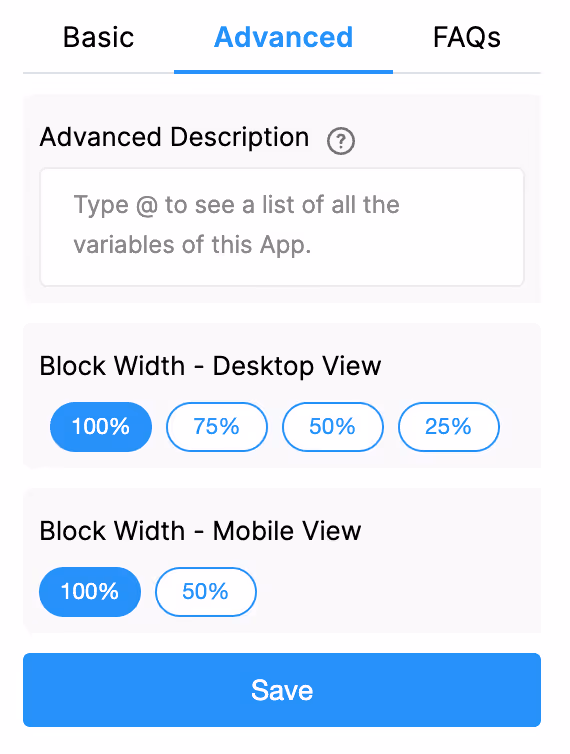
The Advanced Description option allows you to change the description text of a field dynamically based on a condition you define. Instead of always showing the same fixed description under the Basic tab, the field can display different description text depending on the requirements of the form. Use spreadsheet-like functions such as IF, AND, OR, etc., and make use of other field variables to set your conditions. Type @ and select the field.
This is useful when the guidance or instructions for a field need to change based on context, business logic, or user choices.
This allows the same field to adapt the instructions shown to the user without needing multiple separate fields.
Examples
1. Showing nothing until a selection is made
For example, if you have a dropdown field called Visit Category with options Routine and Urgent, you may want the description of another field to remain blank until the user first selects a category.
Once a selection is made:
Formula:
{visit_category}
The description stays empty until the dropdown has a selected value.
After the user picks an option, the selected text (Routine or Urgent) becomes the description.
2. Changing description based on language selection
For example, if your form includes a dropdown field called Select Language with options English, Spanish, and French, you can show the description in the selected language.
So:
Formula:
IF({select_language} = "English", "Enter details", IF({select_language} = "Spanish", "Ingrese detalles", "Entrez les détails"))
The formula returns the description text for the selected language.
Only one description is shown at a time, depending on what the user picks in the Select Language dropdown.
1. Variables do not change
When a field is created, its variable name is derived from the label you set in the Basic tab. That variable name is what you must use in formulas, workflows, and other logic. The visible label or description shown by Advanced Label / Advanced Description does not change the variable name.
2. Submissions tab: table view vs right panel
In the Submissions area, the table view always displays the labels from the Basic tab. When you open an individual submission, the right panel shows the labels and descriptions as they appear in the form (i.e., the Advanced Label and Advanced Description applied for that submission). This keeps the submission list consistent while letting reviewers see the context-aware labels and descriptions when viewing a record.
3. Bulk Edit shows Basic tab labels and descriptions
When you need to Bulk Edit submissions, the spreadsheet you download shows the labels and descriptions from the Basic tab only. Advanced Label and Advanced Description are not applied in Bulk Edit, so keep that in mind when preparing bulk updates.
4. Some fields cannot be used inside Advanced Label/Description formulas
Certain block types do not expose a variable that can be referenced in Advanced Label or Advanced Description. If a block does not expose a variable, you cannot use it inside the formula.
Geo Address
GPS Location
PaymentGateway
Audio
Live Tracking
Signature
Code Scanner
NFC Reader
Get Data from RestApi
Get Data from Other Apps
Get Data from Google Sheets
Get Data from Database
AI Block
Text, HTML & Embedding
Attached Files
Image Viewer
Video Viewer
PFD Viewer
Code block
Progress Bar
Action Button
Desktop View: Sets the width of the Validation block in the desktop view. Options are 100%, 75%, 50%, or 25%.
Mobile View: Sets the width of the Validation block in the mobile view. Options are 100% or 50%.
This is a layout-only setting.
When you configure a Validation block in your app with the Duplicate option enabled, it does not only apply to manual submissions from App Home but also when an admin performs Bulk Uploads or Bulk Edits from the Submissions tab.
Here is how it works:
This ensures that the rules you configure with the Validation block are consistently enforced, whether data is entered manually or through bulk operations.
L374, 1st Floor, 5th Main Rd, Sector 6, HSR Layout, Bengaluru, Karnataka 560102, India
3500 S DuPont Hwy, Dover,
Kent 19901, Delaware, USA


.svg)


3500 S DuPont Hwy, Dover,
Kent 19901, Delaware, USA
L374, 1st Floor, 5th Main Rd, Sector 6, HSR Layout, Bengaluru, Karnataka 560102, India