
Still need help?

Workplace Analytics lets workplace admins view analytics across the entire workplace, instead of inside an individual app. It is meant for understanding overall activity such as how many submissions are being created, which apps are being used more, which users are active, and what platforms or devices are being used across the workplace.
These analytics are not app-specific. The data shown here is aggregated across all apps in the workplace and is intended for high-level visibility rather than detailed analysis of a single app’s fields or workflows.
It is visible only to workplace admins.
Workplace Analytics can be accessed from the left navigation panel > Workplace Settings > select the Analytics tab at the top.
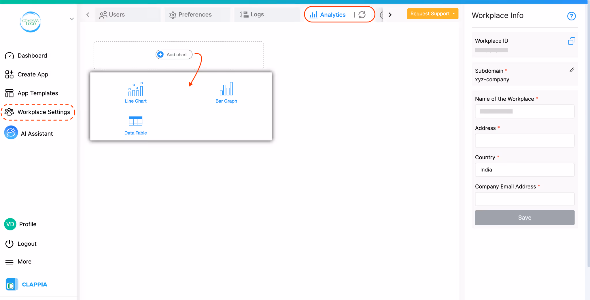
Once you open this tab, you can start setting up charts that represent workplace-level data.
To create a chart, click Add chart and select one of the available chart types. At the moment, Workplace Analytics supports three chart types:
After a chart is added, set it up on the right-hand panel.
Each chart also includes:
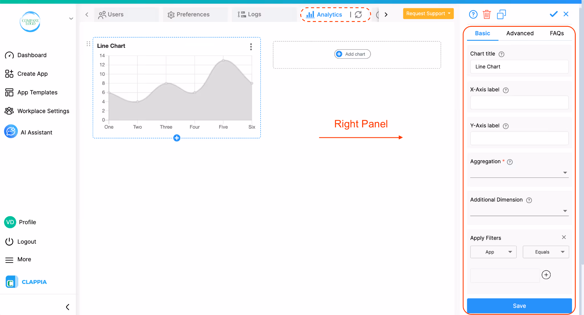
When configuring a chart, the options shown on the right panel control both what is being measured and how that data is organised. These options are specific to workplace analytics and differ from what you see in app-level analytics.
Each chart allows you to set:
Chart title - the name displayed on the chart
Axis labels - for charts that use X and Y axes (Line and Bar charts)
Aggregation defines what the chart is counting or measuring at the workplace level.
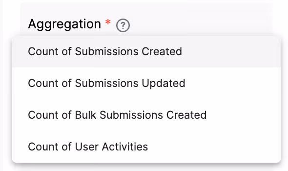
The options include:
These count the submissions created in apps within the workplace. You can see the total number of submissions across all apps, or limit the count to submissions from specific apps or submissions created by specific users using the chart filters.
These aggregations help admins track how actively apps are being used across the workplace.
Dimensions control how the aggregated data is grouped in the chart.
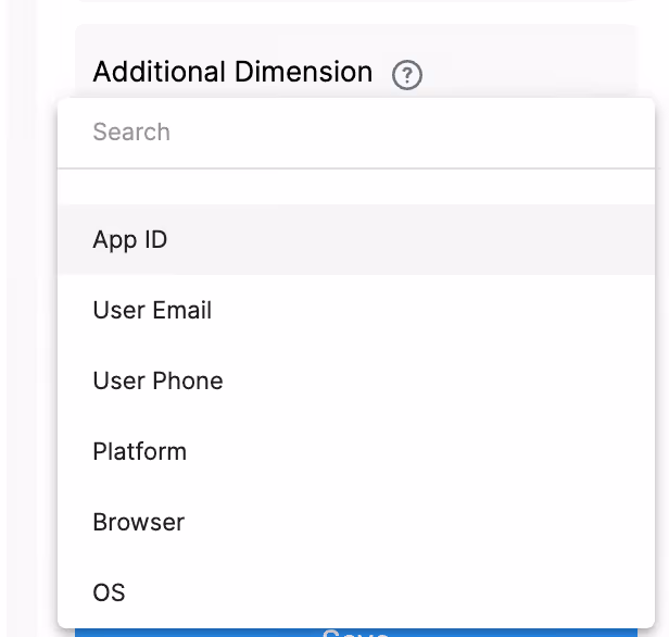
The available dimensions include workplace-related attributes such as:
For example, you could group submission counts by App ID to compare usage across apps, or by Platform to see how much activity comes from mobile versus web.
The chart type Data Table allows additional dimensions, which let you break the data down further and compare multiple workplace attributes within the same chart.
When configuring a Data Table, you can also select additional dimensions. This allows you to break the data down further by adding a second grouping layer.
Note:
User-based grouping is internally mapped using the system user ID. This ensures that analytics remain consistent even if a user updates their email address, phone number, or display name.
For example, if a user initially creates submissions using one email address and later updates their email, all activity will still be grouped under the same user in analytics. The charts will display the user’s latest details, while maintaining accurate historical grouping.
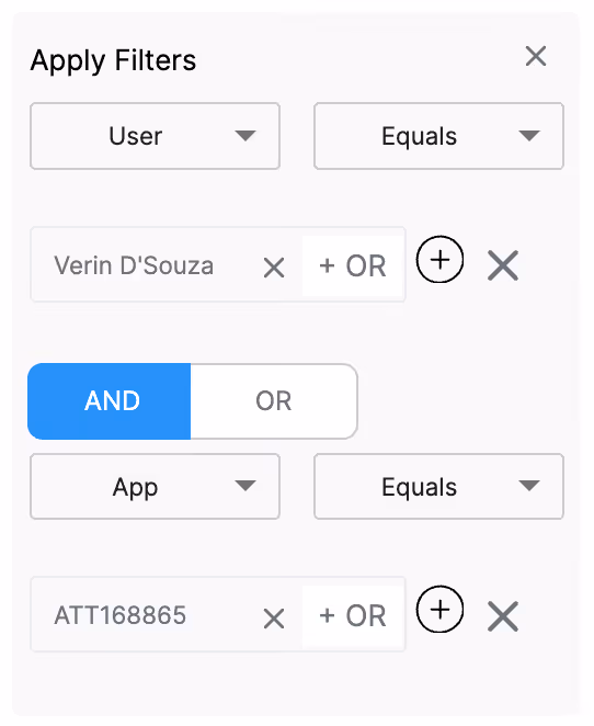
Filters allow you to limit the data included in a chart without changing the aggregation or dimension logic.
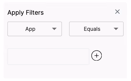
In Workplace Analytics, filters can be applied based on:
You can apply multiple filters with AND/OR logic grouping.
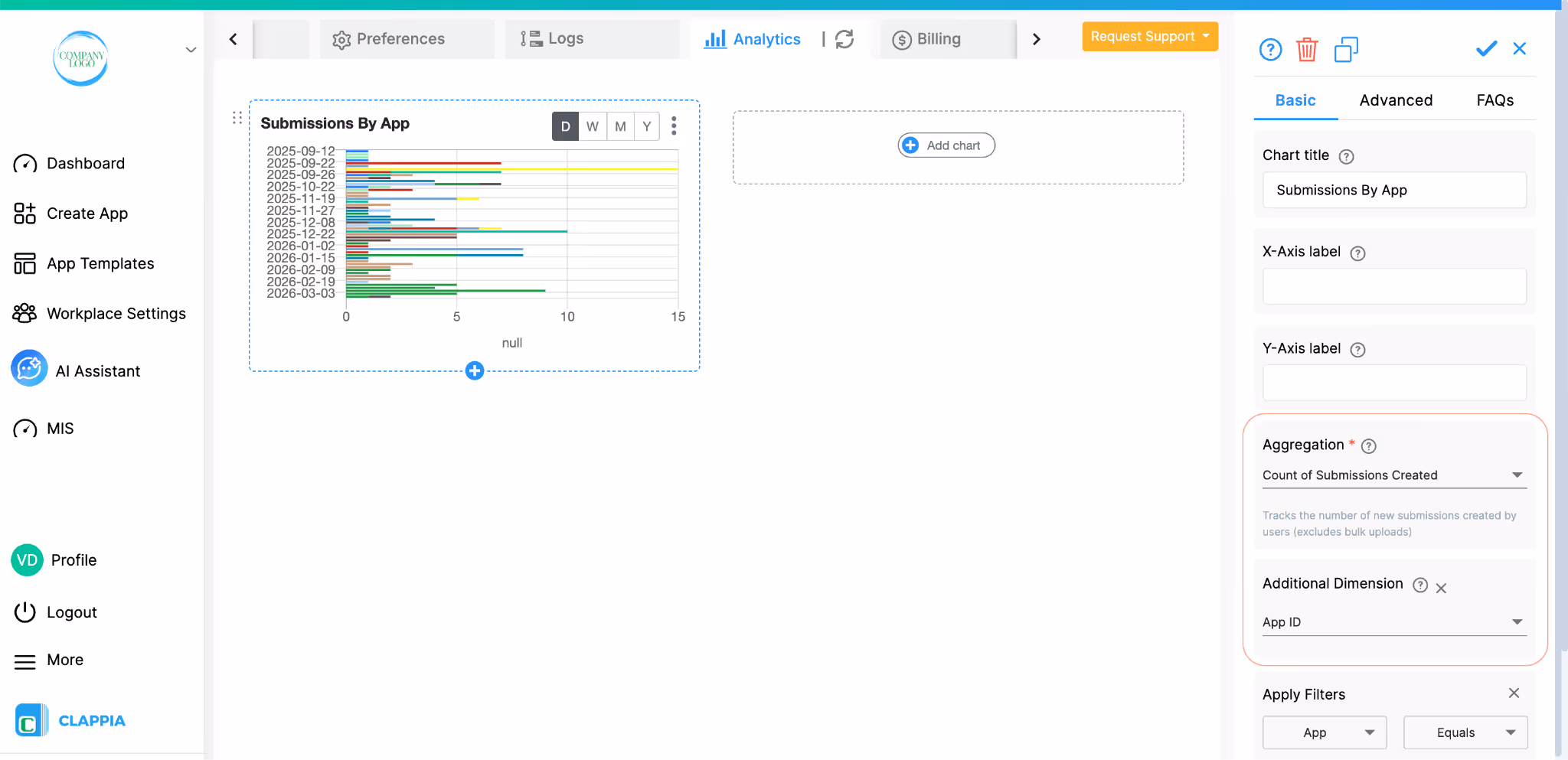
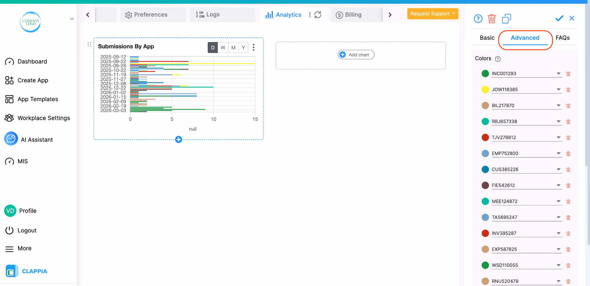
When you click on a chart, the right panel shows three tabs: Basic, Advanced, and FAQs. The Basic tab is where you configure the chart title, aggregation, dimensions, and filters. The Advanced tab gives you additional control over how the chart is displayed, specifically through colour customisation.
The Colours option under the Advanced tab allows you to override the default colours assigned to labels in your chart. This is useful when you want consistent colour coding across charts, for example, always showing a specific app or status in a particular colour.
Note: The Colours option only becomes usable after you have configured the chart on the Basic tab and saved it at least once. If you are setting up a new chart, complete the Basic tab configuration, save the chart, and then re-open it to access the Advanced tab and configure colours.
For example, in the screenshot below, a bar chart is added with the following configurations:
Aggregation - Count of Submissions Created
Dimension - App ID
Once the chart is saved and you open the Advanced tab, you will see a list of labels, each with a coloured circle and a dropdown showing the label name. Each row represents one label in your chart and the colour assigned to it.
How to change a label's colour:
Click on the coloured circle next to any label. A colour picker will open, allowing you to choose any colour using the palette, the hue slider, or by entering RGB values directly.
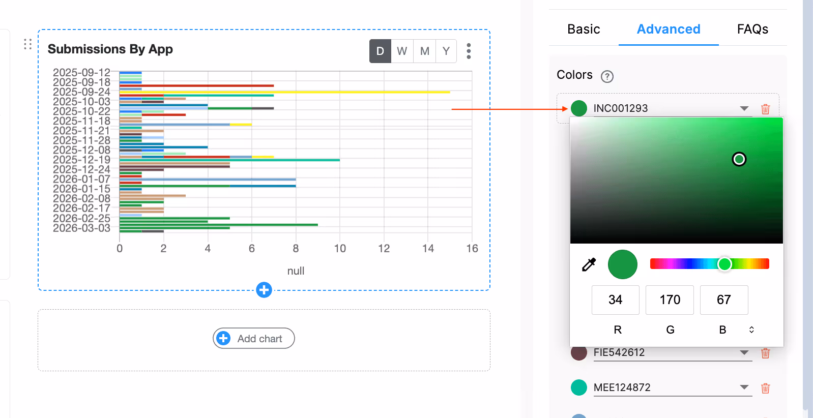
Once you select a colour, click Save to apply it. The chart will immediately update to reflect the new colour for that label. If you close the panel without saving, the colour remains unchanged.
How to change which label a row represents:
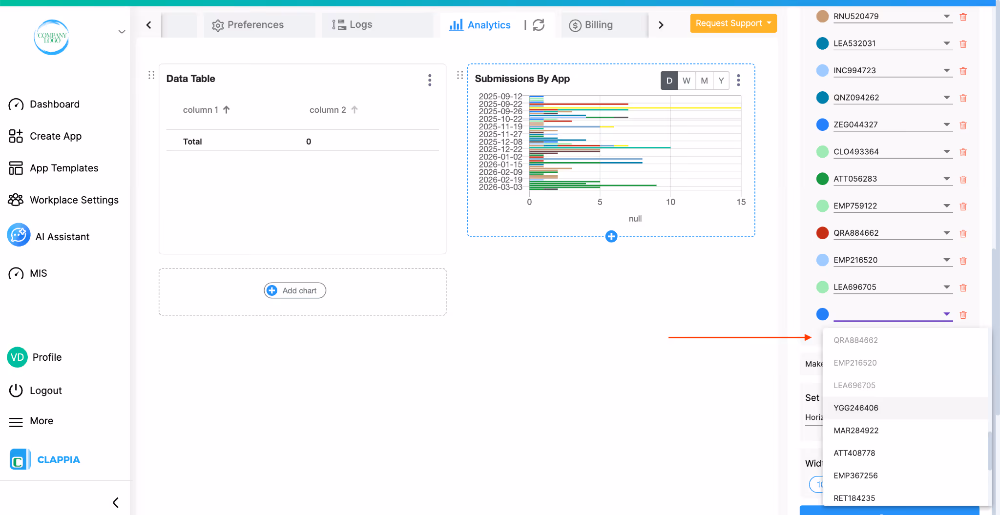
Each label row has a dropdown showing the current label name. Click the dropdown to see the full list of available labels from your workplace - for example, all your app IDs if App ID is your dimension.
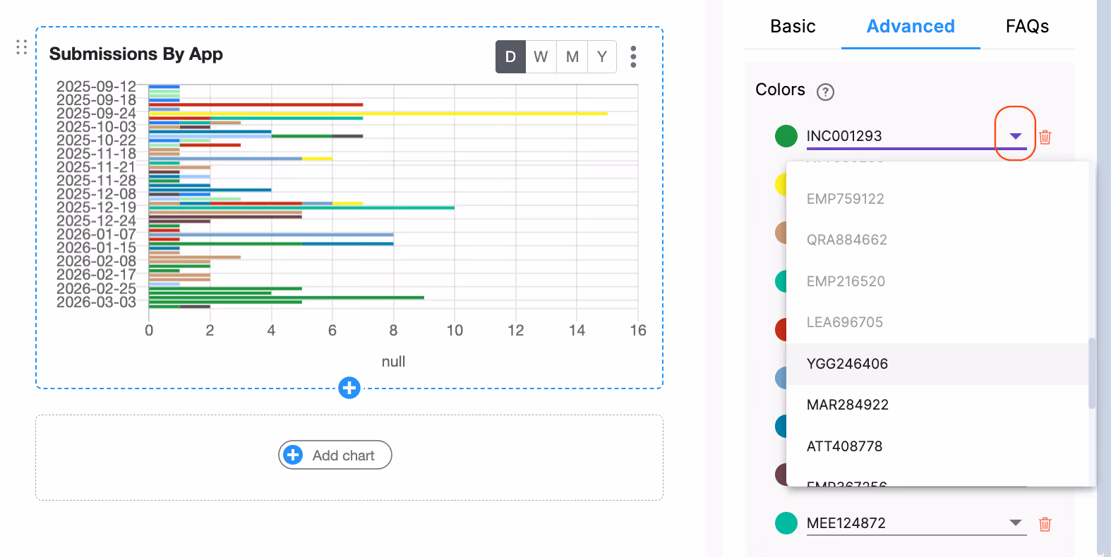
Labels that are already listed in the colour panel appear greyed out in the dropdown so you cannot add duplicates. Select a different label from the dropdown if you want to reassign that colour row to a different label, then save.
How to add a new colour for a new label:
Scroll to the bottom of the colour list and click + Add label colour.
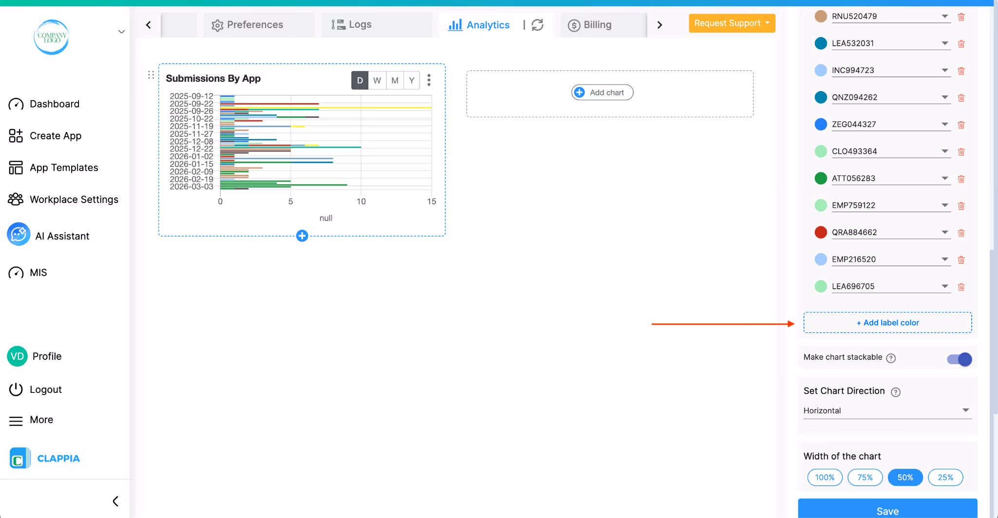
A new row will appear with a default colour and a dropdown to select the label you want to assign it to.
Select the label, adjust the colour if needed, and click Save.
You can add colours for up to 25 labels per chart. Once 25 rows have been added, the + Add label colour button is hidden and no more can be added.
How to remove a label's colour:
Click the delete icon (trash icon) next to the row you want to remove. The row will be removed from the list. Once saved, the chart reverts to its default colour for that label.
Notes on colour behaviour:
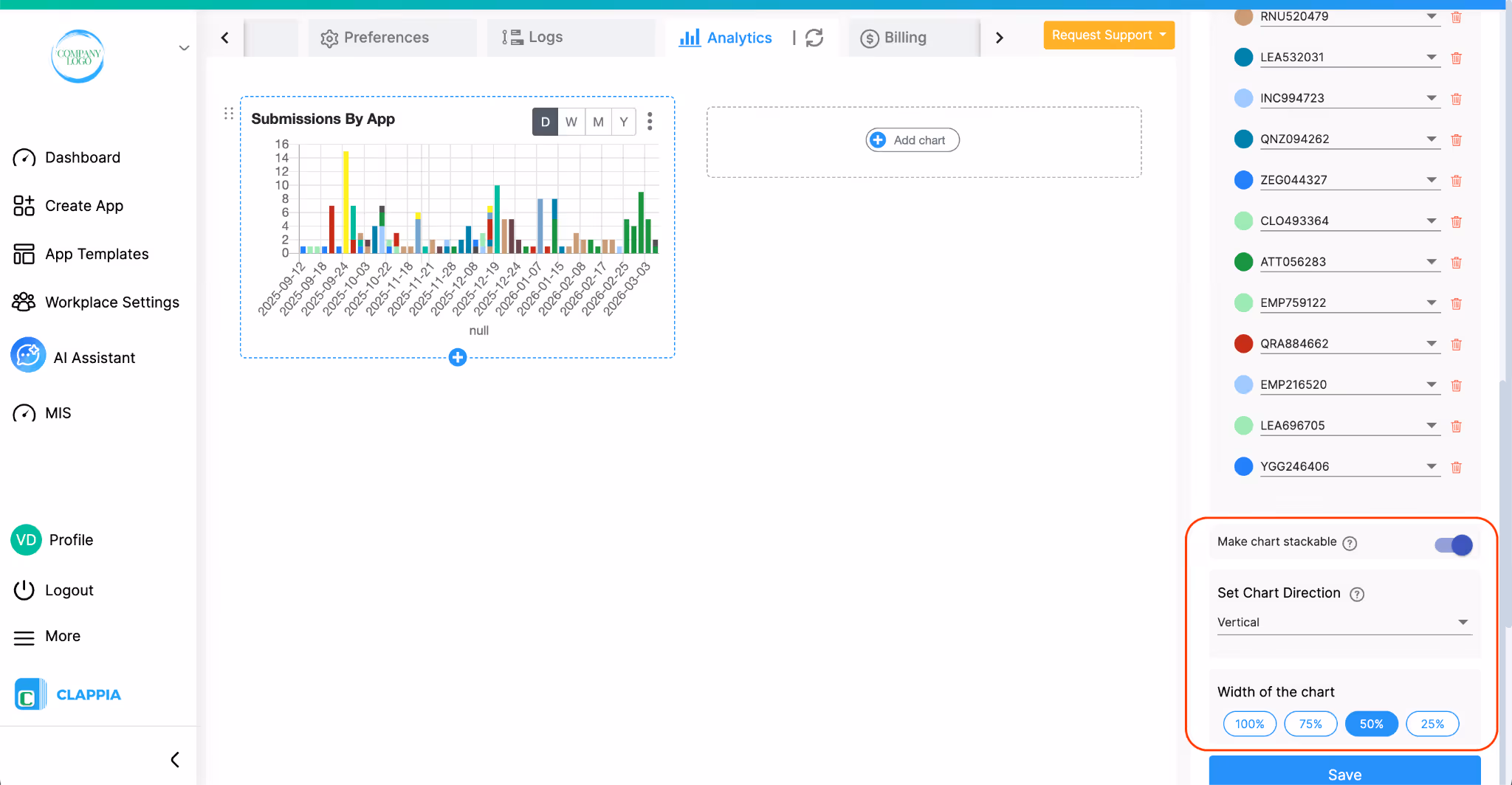
This option allows you to display multiple values stacked within the same bar or line segment instead of showing them separately.
When enabled, values are stacked on top of each other, making it easier to compare the total contribution across different groups in a single view.
This option lets you choose how the chart is displayed.
You can set the direction as:
This helps adjust the chart layout based on how you want to view or present the data.
The Chart Width option controls how wide the chart appears within the dashboard.
Increasing the width makes the chart span more space for better visibility, while reducing it makes the chart more compact so multiple charts can fit within the same view.
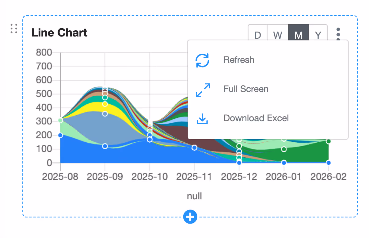
Each chart includes a three-dot menu in the top-right corner with the following options:
Workplace Analytics and App Analytics serve different purposes.
Workplace Analytics counts submissions across one or more apps in the workplace, based on the apps and users selected in the chart configuration. It is useful when you want a combined view instead of analysing one app at a time.
App Analytics, on the other hand, is configured inside an individual app and shows analytics only for submissions made to that app.
If you want analytics for a specific app, such as charts based on that app’s submissions, you need to set up Analytics inside that app by navigating to the app, then go to Design App > Analytics > Live Dashboard.
Any changes made in Workplace Analytics are tracked in Workplace Logs. This includes actions such as adding a chart, modifying an existing chart’s configuration, or removing a chart.
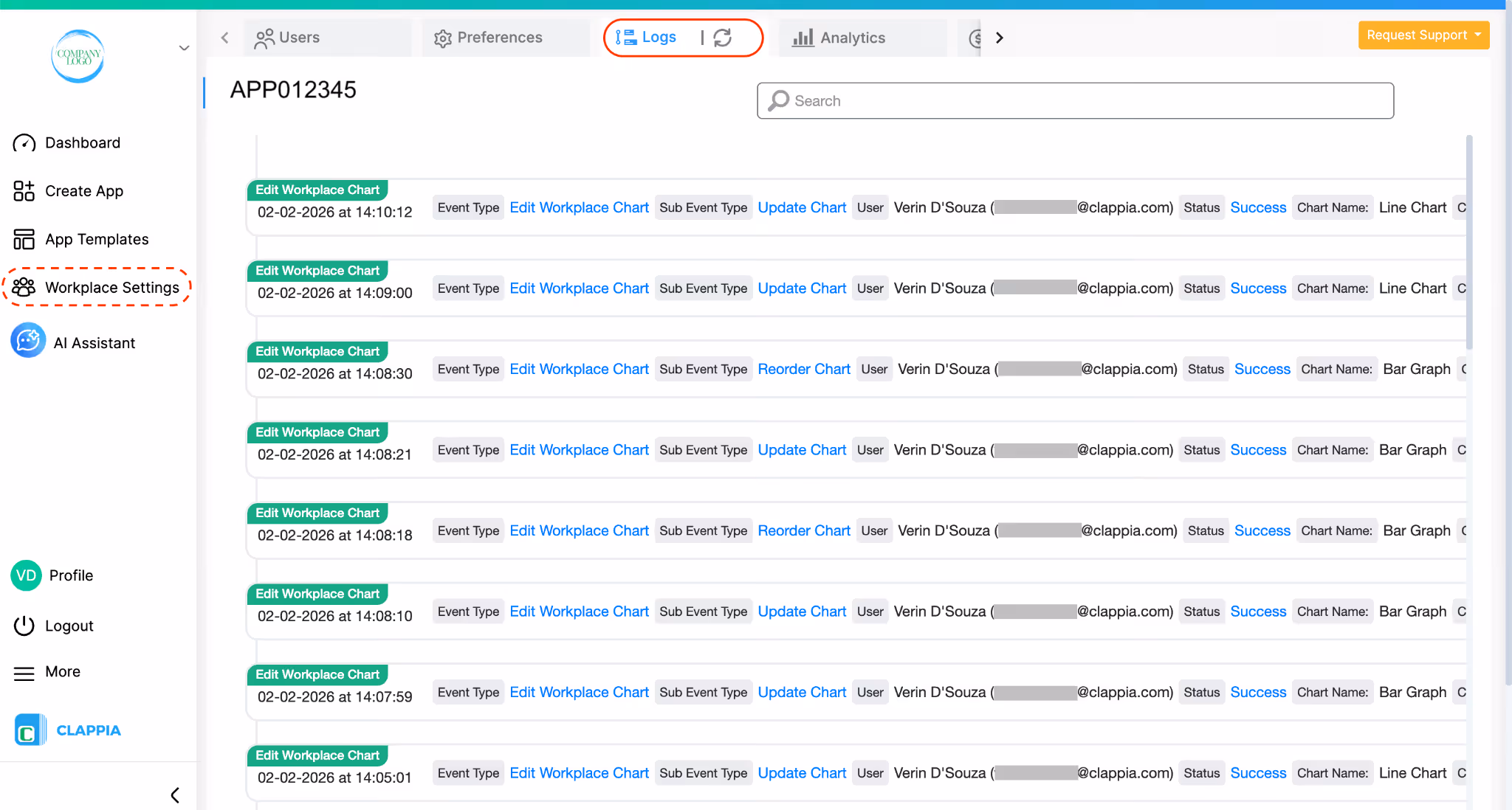
To view this, go to Workplace Settings > Logs.
Workplace admins can use these logs to understand when analytics settings were changed and who made those changes, helping maintain visibility and accountability at the workplace level.
Workplace Analytics is currently available only on the web version of Clappia. Workplace admins will not see the Workplace Analytics section on the Clappia mobile app.
L374, 1st Floor, 5th Main Rd, Sector 6, HSR Layout, Bengaluru, Karnataka 560102, India
3500 S DuPont Hwy, Dover,
Kent 19901, Delaware, USA


3500 S DuPont Hwy, Dover,
Kent 19901, Delaware, USA
L374, 1st Floor, 5th Main Rd, Sector 6, HSR Layout, Bengaluru, Karnataka 560102, India
.svg)
